'Zine Skillshare Class by Kate Bingaman-Burt
I’m a total Skillshare fan (read addict)! I watch classes about all kinds of topics; some of them far outside my field. This class by Kate Bingman-Burt is all about creating your own ‘zine and I thought it was so much fun. It make me really want to try and get my hands on an old laser copier!
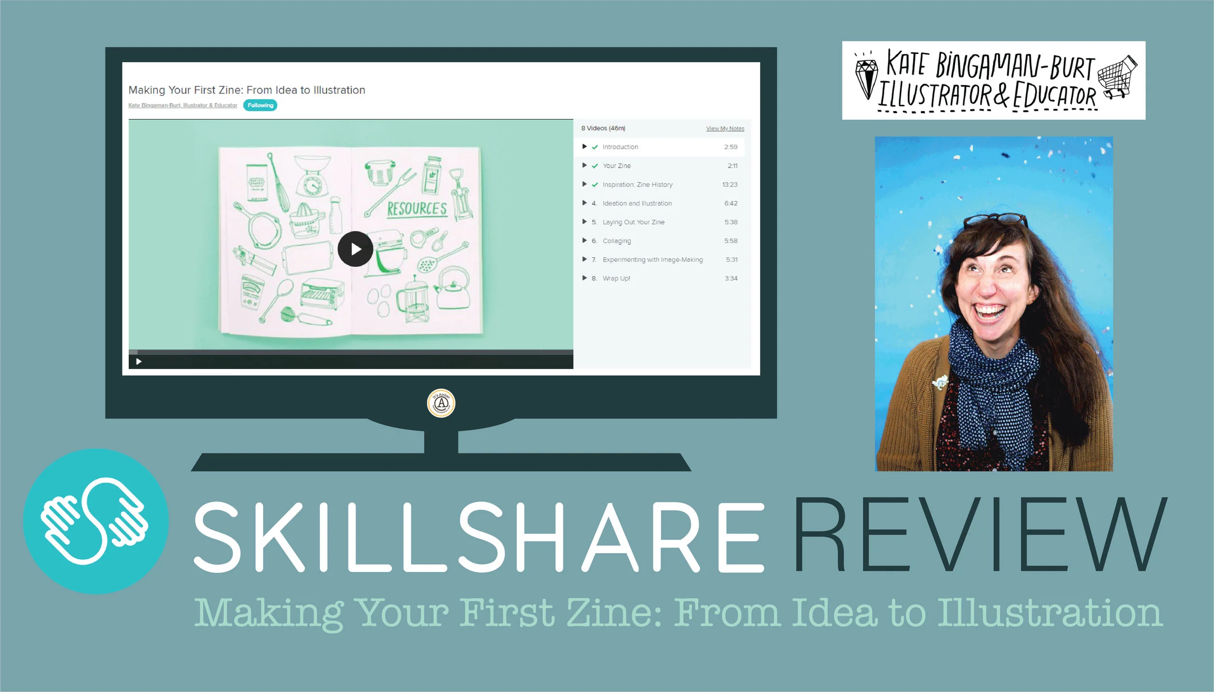
Tonight I watched a really great Skillshare class - Making Your First Zine: From Idea to Illustration by Kate Bingaman-Burt. (I'm making a mental note to add her to my Instagram roll which I'm working hard to finish up so maybe you can discover some new creatives, too!)
I loved everything about this class. I adore Kate's dynamic personality and how she really shines in front of the camera. I love her studio and workspace - it's a delicious explosion that had me continuously hitting the pause so I could get a closer look. And I was really drawn into the funky crazy world of indie magazines.
I chose to watch this class because of a couple of other projects that i'm putting on my shelf of possibilities. This class was simple and straightforward and Kate encourages students to just dive in and do it without overthinking the process. Part of the appeal of indie 'zines is that hand done feel. The process of design and manufacture is a great part of the appeal. After watching this class I think I may be moving those projects up closer to the top of the pile.
Hop on over and watch for yourself!
(If you use the links in this post you will receive two free months of Premium Skillshare Membership. In return for the referral I will receive a month of my membership for free as well!)
Make Art That Sells Bootcamp
So this year I have been taking classes. I have a lot of things to write and share but I thought I would start by just sharing where I am right now.
I'm currently enrolled in Lilla Rogers Make Art That Sells Bootcamp course. Bootcamp is a five month long class. Each month we receive a mini assignment to explore and play with. Then on week two we receive our assignment in the form of a brief.
Our first mini assignment was 1920's hairstyles. I began exploring the 1920s pretty deeply that first week. I watched a couple of TV shows, created a Pinterest board, and after a lot of sketching I even did some watercolor pieces. I discovered that I have spent a long time avoiding drawing faces and this assignment forced me to face that fear.
The brief that we were given to work from was to design an adult coloring book cover. We were given leeway to make the project fun for us, so I turned my project into a color your own desktop calendar. Here is the layout I came up with:
Personal Goal: 100 Patterns

If you've been reading along you know that almost two years ago I decided to dust off my art skills and try to return to some freelance graphic work. I spent the majority of that year relearning and mastering Adobe Illustrator and becoming familiar with Photoshop and LightRoom. I was also determined to learn how to use my camera and do some simple video editing. At the end of that year I had not only dusted off my skills but had grown in my design capabilities. I began doing some custom graphics work - mainly logo and identity work. It was good to be working again, but I wanted to do something a bit more creative.
I had always wanted to learn to design fabric. As a little girl I would lay under my great grandmother's flour sack quilts and study all of their patterns. Before all the boys were born I used to follow designers like Kaffe Fassett and Susan Singer Sargent mainly because I couldn't get enough of their colors. I began drawing designs by hand with markers and exploring different ideas for collections, but I didn't know how to create the repeats. I did get access to a technical book via interlibrary loan but it was hard to learn just from a book - especially when I could only keep it for such a short period of time.
Then along came all of my boys, a couple of moves, and then the decision to homeschool and all of my art just got shoved in a box. Last year I dusted off that box and began pulling out all of my work. I discovered Creativebug and SkillShare and sites like Make It In Design and Make Art That Sells. In short, I found an entire community of artists with dreams just like mine. I saw many artists who are not only creating designs for fabric, but for a whole host of other products and markets.
I began taking every class I could and I learned multiple ways to create repeat patterns. But the patterns I made were a bit stiff and and I had no idea where to go with my style. One line from Bonnie Christine's Intro To Surface Pattern Design echoed in my mind - "That year I made hundreds of patterns." That seemed like a good solution - just make pattern after pattern and see where that would lead me. So sometime in December I decided that I would make 100 patterns. I began the project in a rather amorphous way and I didn't really have a way to keep track of and count my patterns.
So now I am attempting to keep track of each of my patterns on my website and be consistent to number them when I post them on FaceBook and Instagram. To meet this goal I am only counting technical repeats not 'surface designs' that don't repeat. It's going to take me a little time to format and catalog the images for all of the patterns I have done thus far but keep checking in and I'll post an update when it is current.
(You can view the gallery by clicking the image above or the blog button to the right.)
Pattern and Color Play

Today I rewarded myself for all of the hard technical and graphic design work that I've been doing lately with just a little bit of play. I wanted to do a quick pattern without having to do very much drawing and I wanted to work with some of the techniques I have learned in Bonnie Christine's Skillshare classes.
My patterns still don't have the flow that I would really like them to have. The only way to get there is to make pattern after pattern. In fact my current goal is to make one hundred patterns! I am well on my way and in the upcoming days I'll be doing a blog post for each one and creating a special page to collect them in.

So what kind of pattern could I make without drawing? When I was at the UNCC garden back in December I picked up some beautiful oak leaves and brought them home to scan. I had seen several artists use scans of real objects in some greeting card artwork and I thought I might give that a try.
I brought the scans into illustrator and used them as a guide to practice drawing shapes with the blob brush. I quickly had some nice organic shapes to play with. Just as I did with Firethorn I made this pattern using the pattern maker tool in Illustrator. I did everything all in one color - I find that I can focus more on the flow of the pattern if I'm not distracted by color.

When I had the pattern working then I began to play around with color. I decided to emulate Victoria Johnson and treat pink as a neutral. I love the yellow browns against the pink. I put the muted purple or mauve color into the blog header because I'm trying to find my way with color. I am striving for a bit of surprise with color - something that might make you look twice....not quite jarring but just a bit unpredictable.
Thanks so much for your encouragement through Instagram and FaceBook. I am so very happy with this new SquareSpace website. I feel like it's a simple and clean aesthetic and I can just focus on my art.
I wonder how many patterns I can make this week?

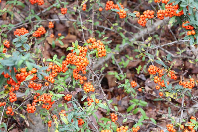
Firethorn
A repeat pattern in Adobe Illustrator using the blob brush tool. The pattern inspiration is the pyracantha commonly known as the firethorn.

As I prepare to enter the new year I am thinking hard about the things I learned this year - for that matter the things I learned in the last decade. This year I will turn forty. It was looking at that number which prompted me to take more seriously my dream of being an artist. More specifically a designer and illustrator. I have carried around ideas for surface repeat patterns in my head and in stacks of paper for almost fifteen years. This year that dream sprouted into a tiny seedling of reality.
I have spent a good majority of the last several months learning how to make patterns, really mastering Adobe Illustrator and beginning to learn how to use Adobe Photoshop. I have learned the basics of pattern making and have about a dozen or so under my belt. For the next several months I plan to work hard to complete the first illustration goal I have set for myself - create 100 patterns. Today I added another to the list - this cheery print titled Firethorn. When we first bought BrightHouse there was a firethorn (also known as a pyracantha) shrub growing against the house. As with most of the shrubs and trees around our home they were planted too close to the foundation - not taking into account the full maturity of the size of the tree. This firethorn also happened to be in the only sunny side of the house. So I removed it to install a raised bed where we now have several blueberry shrubs.
Today I visited the UNCC Botanical gardens to get outside a bit. I took my camera to snap some reference photos and some pictures for color inspiration for future designs. I also stuck my sketchbook in the bag just incase there was a non drizzly moment to do a few sketches. As I walked through the garden I came across a very small firethorn tree growing close to the ground and was smitten by its cheery color in the winter garden. I had forgotten how pretty a shrub that it was. I'm not sure if the one in the garden which was petite because it was a different variety, or because it was carefully pruned and trained - but it's back on my list of plants to learn more about and perhaps find a home for in my garden.
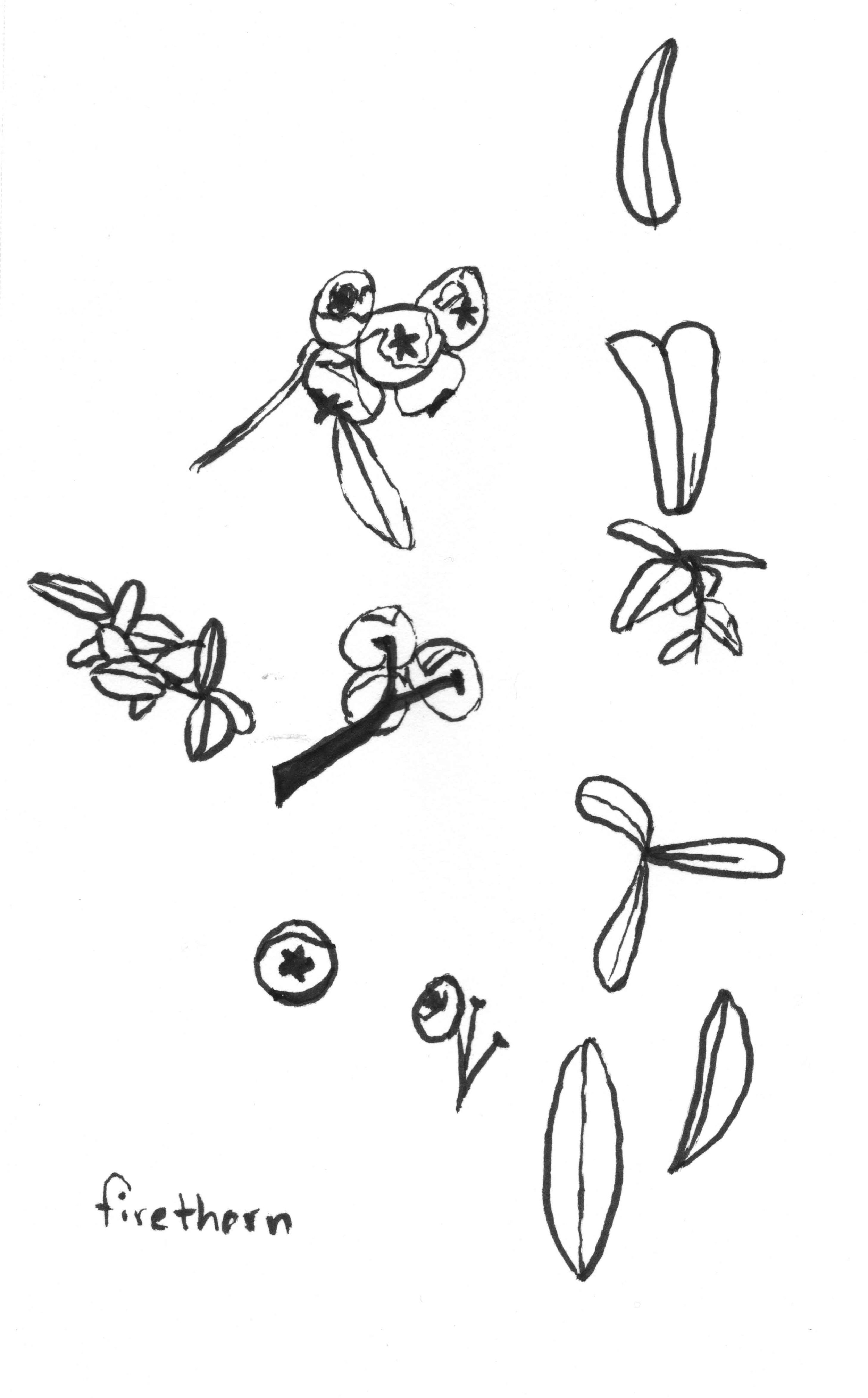
Just before I left I took a few moments to sit on the rock wall and do a few rough sketches. I'm trying to draw every day - I often draw from books or photo references, but I'm trying to make a larger majority of my drawings from life. I've also begun using a micron to draw with to make me think carefully and more confidently about my lines. I find that drawing with a marker or pen makes me look more carefully and see the shapes and lines more carefully as I draw. When I got home I scanned the sketches into Photoshop and dropped them into Adobe Illustrator where I began to turn the sketches into design elements. I used one of my photo references to help me pick a color scheme.
I used the blob brush in Illustrator to draw over my sketches - there is a great Skillshare class by Bonnie Christine which teaches illustration using the blob brush. When I had completed the basic elements I decided to add some depth with highlights and shadows. I made those layers transparent and that gave my illustrations a more painterly rather than a flat look.

I then took these elements and made an arrangement on the art board which was pleasing to my eye. I did not worry about the repeat because I knew that I was going to finish the pattern using the Adobe Illustrator's pattern tool. One thing I was careful to do, however was to use multiple copies of some of the elements in my layout as this makes the repeat harder to see. When I was all finished I tried out a few colors in the background to see what some different color ways might look like.
Below you can see how the pattern was developed start to finish:

How To Remove One Pixel Transparent Borders
So, you've finally mastered creating repeat patterns in Adobe Illustrator and you have this really cute pattern that you want to use as your website background. You save it for web, upload the graphic into your WordPress media folder, and excitedly refresh your page. It's awesome! Wait - what!? Why can you see the repeats? Where is that border coming from around your image - it worked perfectly in Illustrator?!
Read on to find out how to fix your pattern repeats on your website...
It's really helpful if you are an illustrator, graphic designer or surface pattern designer of any kind to have at least basic web design skills. Mine are just that - basic. I rely heavily on Google, Wordpress Forums, w3school and classes on Lynda.com. (It is also helpful to be married to a software developer, although I am trying to do as much as I can on my own.) When I set up this website I wanted to be able to showcase my repeat patterns as background images and in my header.
But I kept running into a problem - when I uploaded my images to WordPress and set them as my background image I could always see a very faint line where the pattern repeated. After a lot of head scratching I finally discovered that there was a one pixel transparent border that was totally ruining the effect, but I couldn't figure out where it was coming from. The repeats worked perfectly in Illustrator. When I searched online I found other people who were struggling with this same issue but I could not find a clear answer. Since I knew the pattern worked perfectly in Illustrator I assumed this was a problem with borders, margins, or padding in my .css.
It turns out however that it was an Adobe Illustrator issue after all! The border appears when you save your image for web without having your artboard aligned to the pixel grid.
After a couple of hours searching and posting on the WordPress forum I found this article which showed me how to remove one pixel transparent borders from my PNG files. Click over for great screenshots and explanations:
White border around transparent PNG after Illustrator export?
Following the steps in this article fixed my issue. Each time exported my artwork from Adobe Illustrator I was sizing the art board to fit the selected artwork wherever it happened to be located on the the screen. This was causing my art board to not be aligned to the pixel grid and giving me a transparent border in my PNG file.
So now I have a new routine. I make sure the art board is aligned as described in the article and has the same dimensions as my artwork. Then, I use the align tool to align the artwork to the art board before exporting by saving for web.
Voila! No more pesky transparent borders - only seamless repeats!
(Since writing this article not only have my web design skills greatly improved but I decided to go with a cleaner website design and ditched the pattern repeat in the background. 1/30/2017)
Support My Projects
If you like what you read and see here and are interested in supporting my work feel free to click the button below.
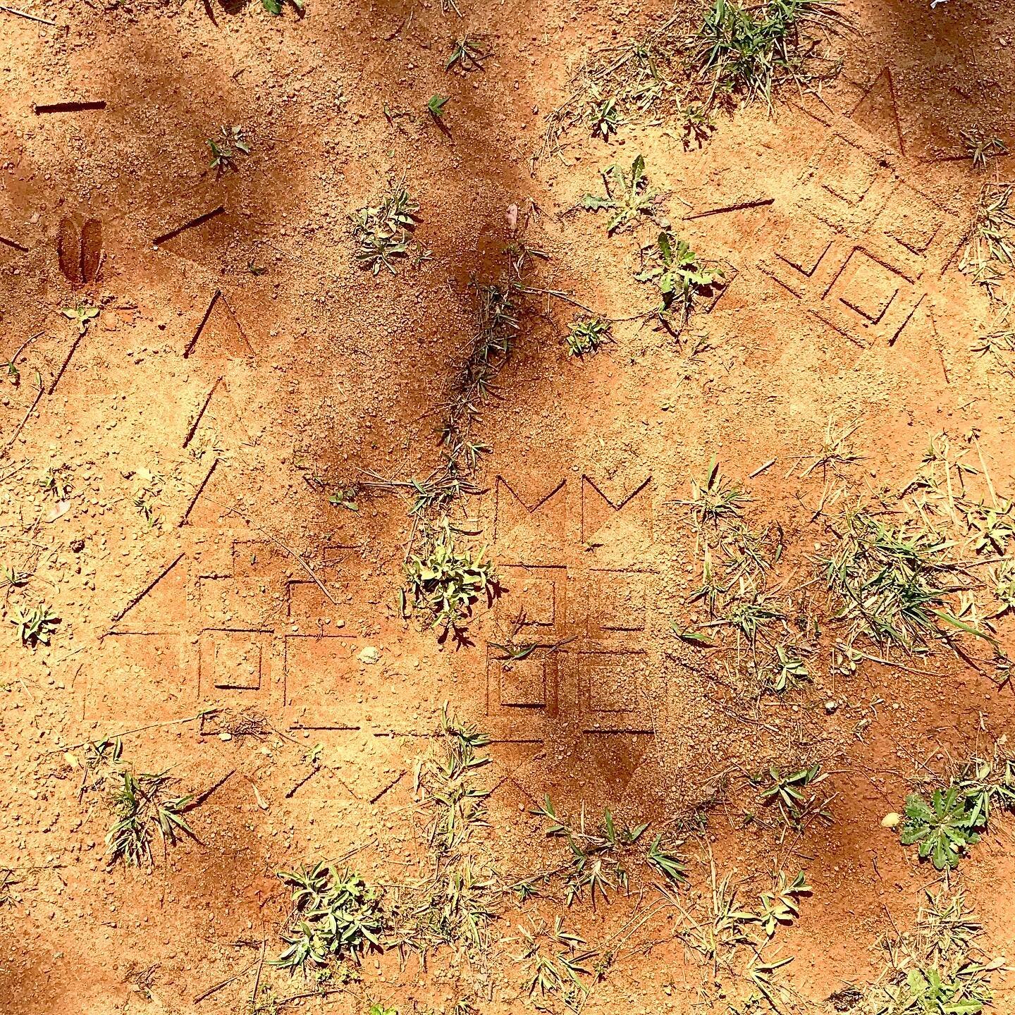
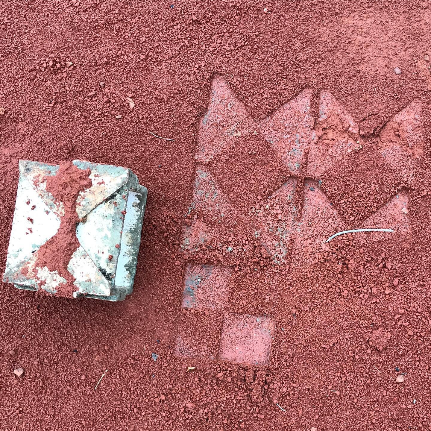
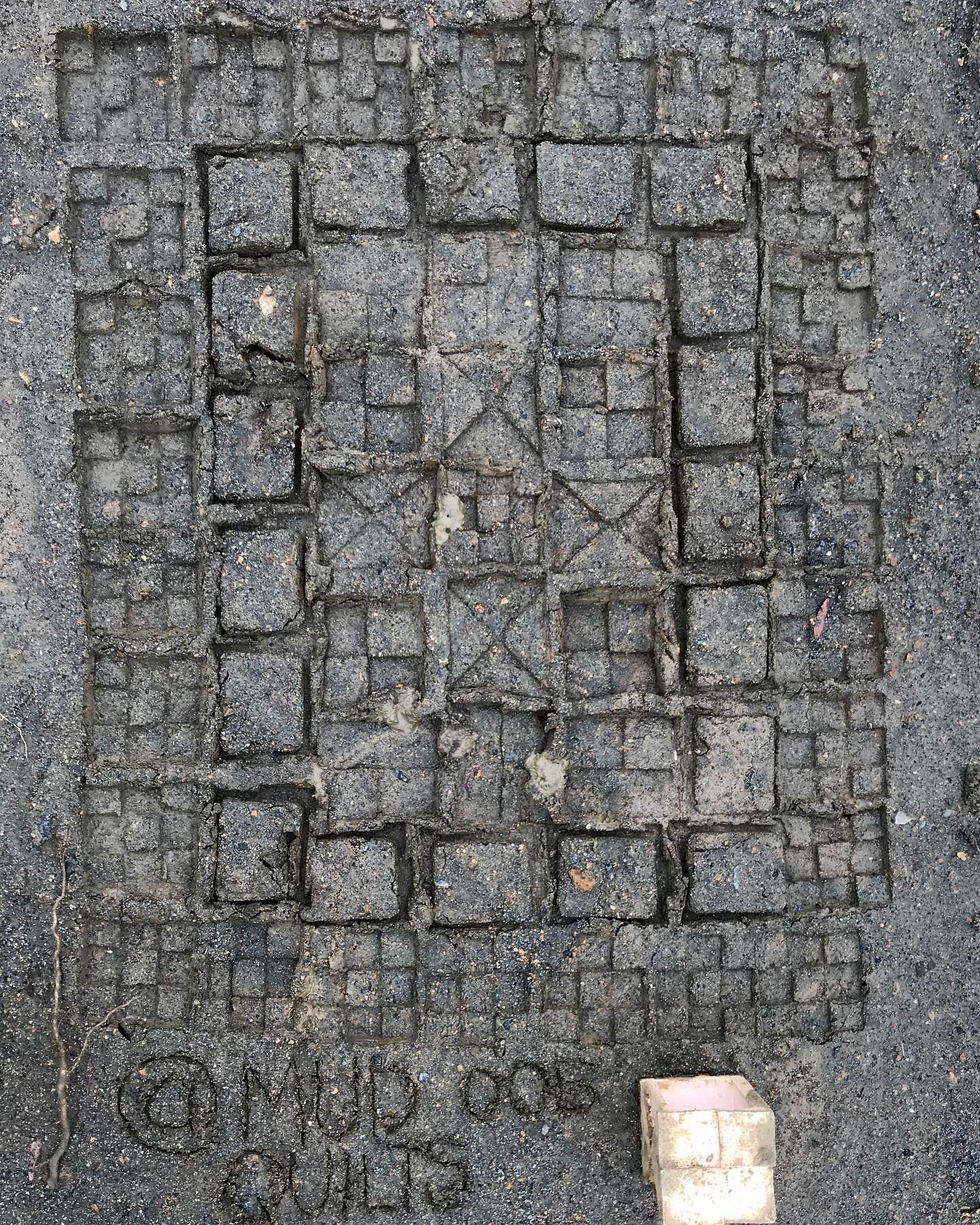
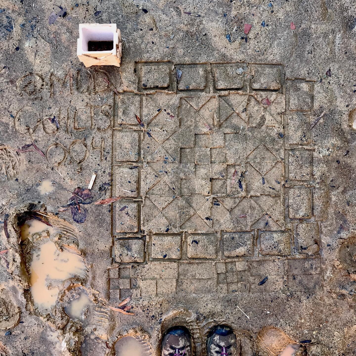
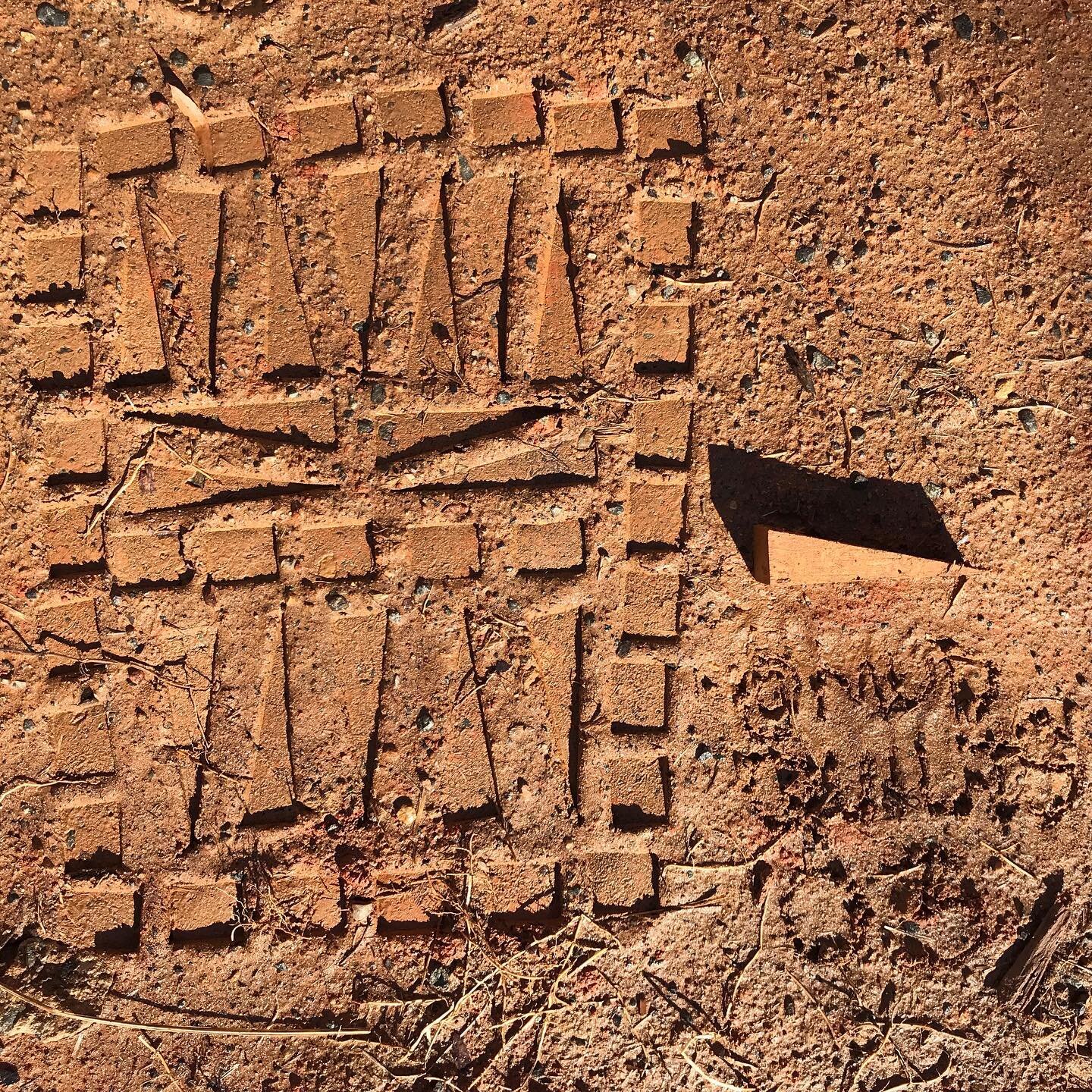
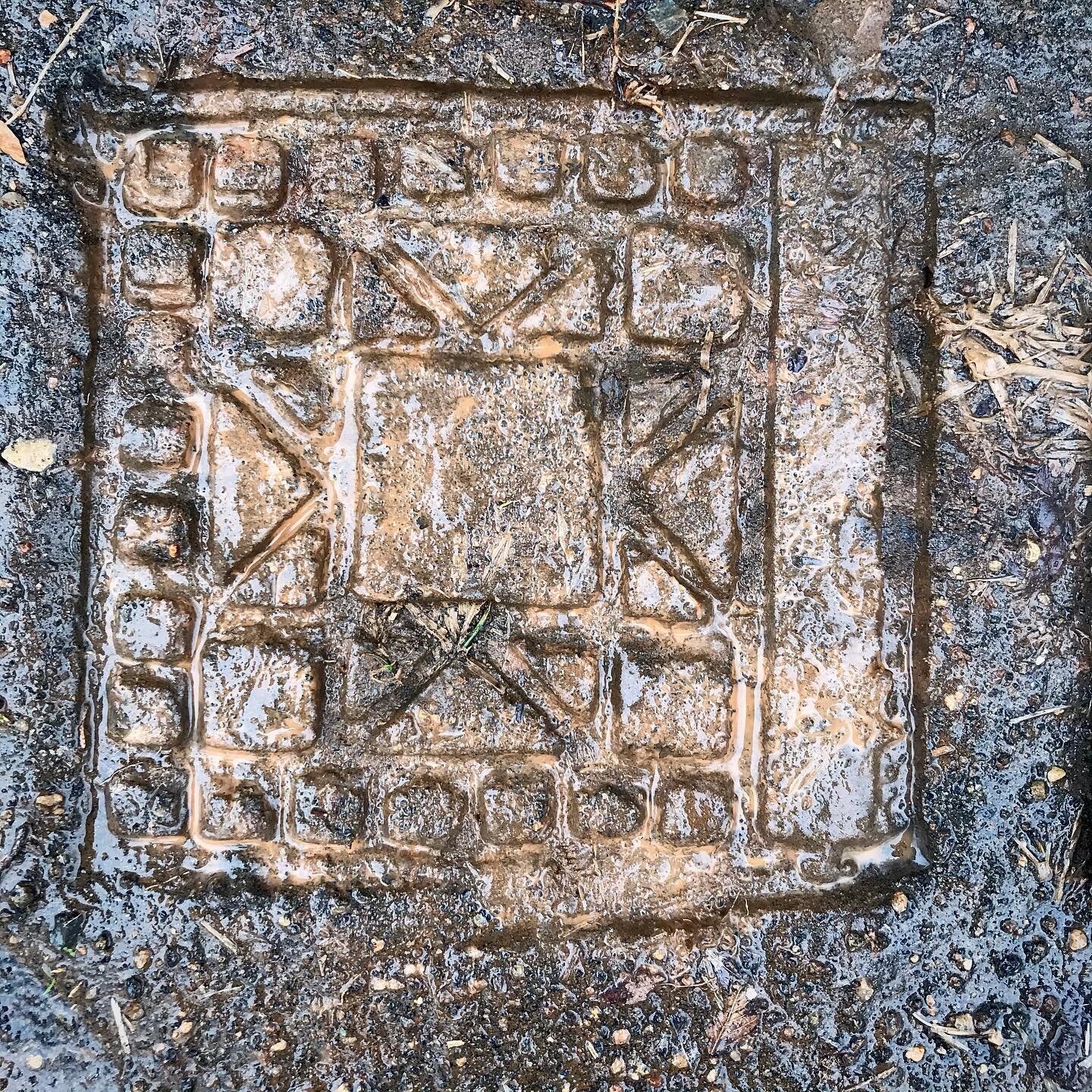
mud quilts project


Personal Instagram